When it comes to building a robust brand identity, having a style guide and a brand book can make a huge difference. While both are integral to making sure your branding message is uniform across all platforms, they have unique functions. Can’t tell the difference? No problem. In this article, we’ll unpack the formats to help you decide which one fits your current branding strategy.
The difference between a style guide and a brand book
Style guide
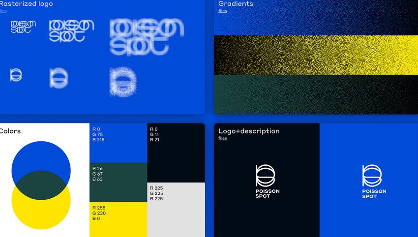
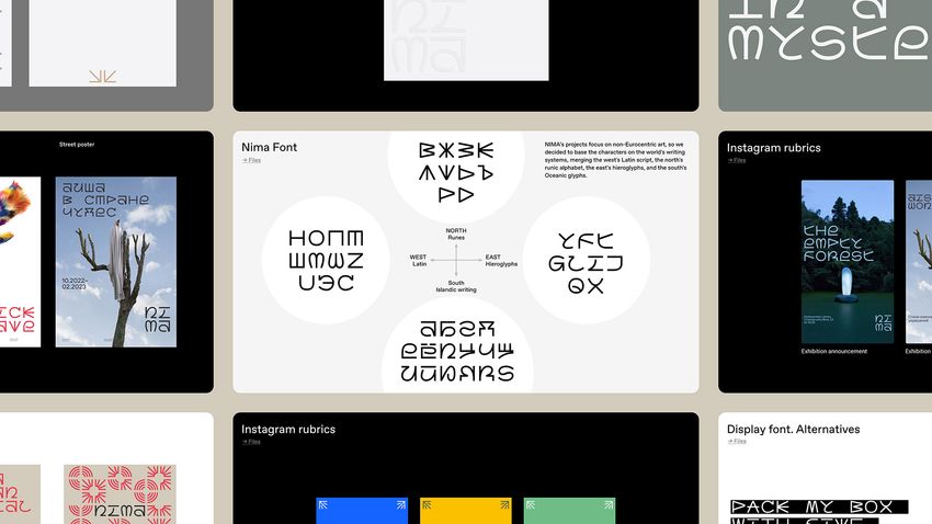
A style guide, or visual guide, acts as a reference for both in-house and external designers. It outlines the identity concept, the branding system elements (logo, fonts, colors, branding), and the rules of usage to ensure accuracy and consistency.
When do you need one? Any brand with a defined identity should have clearly described guidelines for its use. The style guide should be formulated with increasing detail, depending on the complexity of the visual identity system.
Brand book
A brand book, or brand manifesto, defines the brand’s values, mission, and ideology. It serves as a source of inspiration for employees and motivates them to stay true to the core concept of the organization. This ideology should be reflected in all aspects, from the visual design to the communication tone. Having a clear understanding of the entire company is what a brand guide is for, which is why it is sometimes called a “brand bible”.
When do you need one? A brand book is generally created for larger teams, after your business has grown, to make sure all information and processes are consistent and coherent when dealing with your brand identity and ideology.

Deciding which one suits your branding goals
If you are starting a new business or rebranding an existing one, it’s important to consider both a style guide and a brand book as part of your overall branding strategy. A style guide will help you to ensure visual consistency across all of your marketing materials and channels, while a brand book will help you to clearly define and communicate your unique brand identity.
It’s up to you to decide which one is right for your brand, but in our opinion, a style guide is a good place to start, as it gives you the foundation to build on. Once you have your style guide in place, you can move on to creating your brand book and building out your overall branding strategy.

Co-founder of the design studio ESH gruppa Stefan Lashko’s favorite style guide
When it comes to style guides, I have one I always come back to: “104” by Experimental Jetset. It reminds me of The Beatles’ White Album or The Black Album by Metallica. Old but gold, as they say. I enjoy showing it to students and urge everyone who hasn’t “listened” to do so.
Given its age (first released in 2007), it may come across as dull, ugly, and (oh no) devoid of animation. Simply put, irrelevant. But much like I did with those iconic albums when i first heard them as a kid, I fell in love with “104” the moment I laid eyes on it during my freshman year of design school. Which is probably why I am so devoted to it. Also,
- What makes it truly special is that it is not only a style guide, but a window into the history and evolution of the 104’s visual identity. In that sense, it’s a record as much as it is a guide.
- The guide is presented vertically, similar to a book. As you page through, it reads like a 220-page documentary. In two parts.
- While mockups are nowhere to be found, each principle and every layout are clearly illustrated and intelligibly described. Think of it as a well-written user manual.
- Experimental Jetset may present all of their brand identities this way, but “104' is truly the star of the show.


More style guide inspiration
Recently, lots of companies have opted to make their style guides public, presenting them in a web-based format. Not only do these guidelines give designers insight on how to best portray the company’s concept, but also make the content easier to digest for the audience. If you’re in need of some inspiration, here are a few well-made public guides we can recommend:
Wise
Wise, a global fintech company, has created a playful yet sophisticated brand that extends into their style guide. Everything is great here: both the flawless presentation and the very handy, easily accessible guide system. We see it like this: if your brand is bold enough to share the guidebook with the public, your design game is probably on point.
Twitch
This site is one of our favorite presentations of identity. The use of memes, coupled with the quirky built-in mini-games add an unmistakable air of fun that hits the brand personality perfectly, and immediately infects the viewer. It just makes sense!
Paris 2024 Olympics
While not an instructional guide, this is a remarkable display of the Paris Olympics’ brand aimed at the general public. You may love or hate this identity, but its well-crafted presentation should not be overlooked.
Spotify
Spotify is a leader in the world of streaming services, working to guarantee a superior listening experience for all users, no matter the platform. This guide details how to seamlessly integrate Spotify’s branding into any other app, emphasizing the significance of maintaining its style and energy while creating the product’s user interface.


